Amita Health is a Chicagoland based group of hospitals formed by two existing systems: Alexian Brothers Health System and Adventist Midwest Health. They needed a new brand that honors the legacy of the existing entities and emphasizes friendly and clear communication to patients. The name is from Indian, Italian and Hebrew origin and means “friendship” in Italian, “truth” in Hebrew, and “Infinite” in Sanskrit.
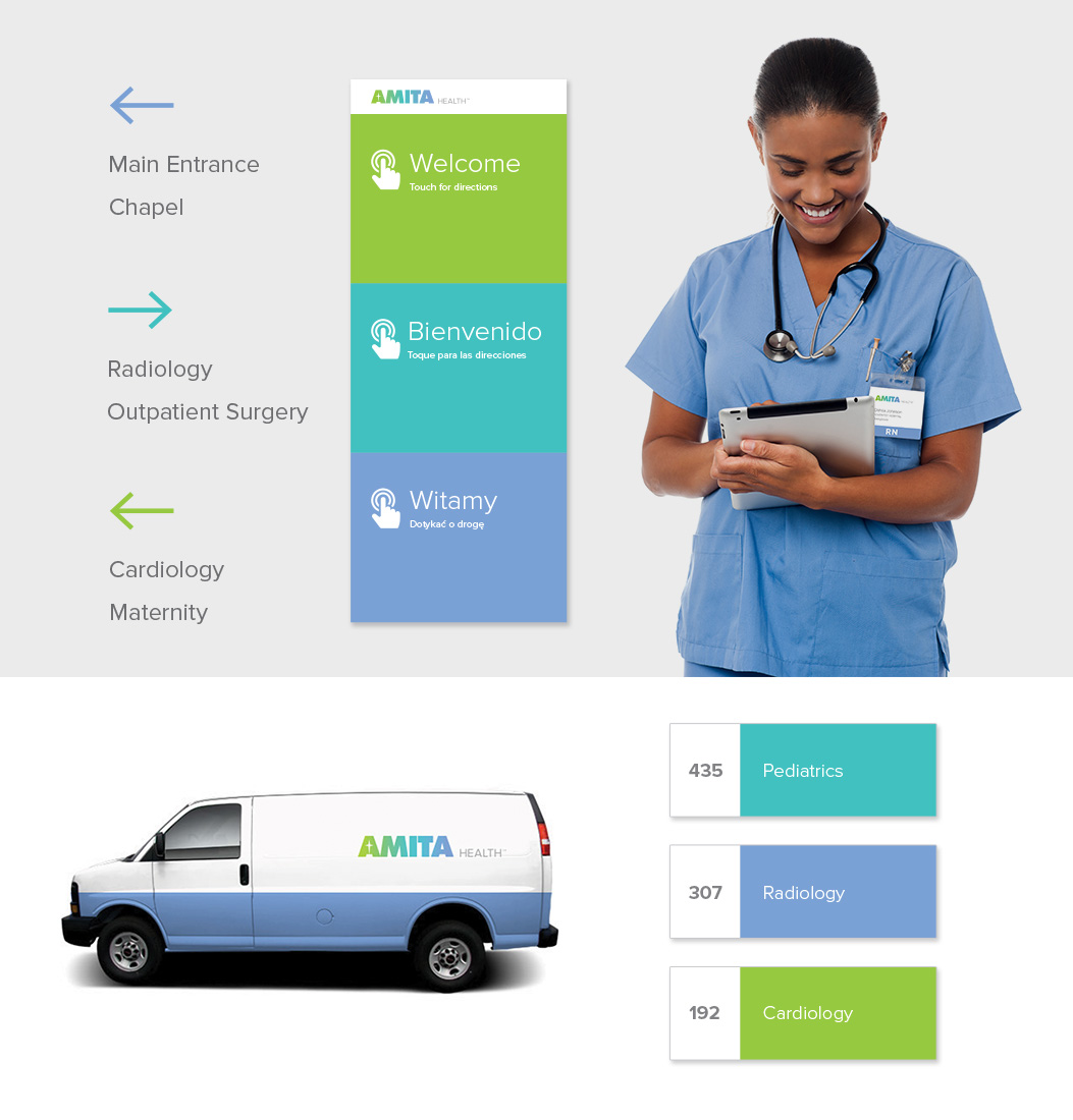
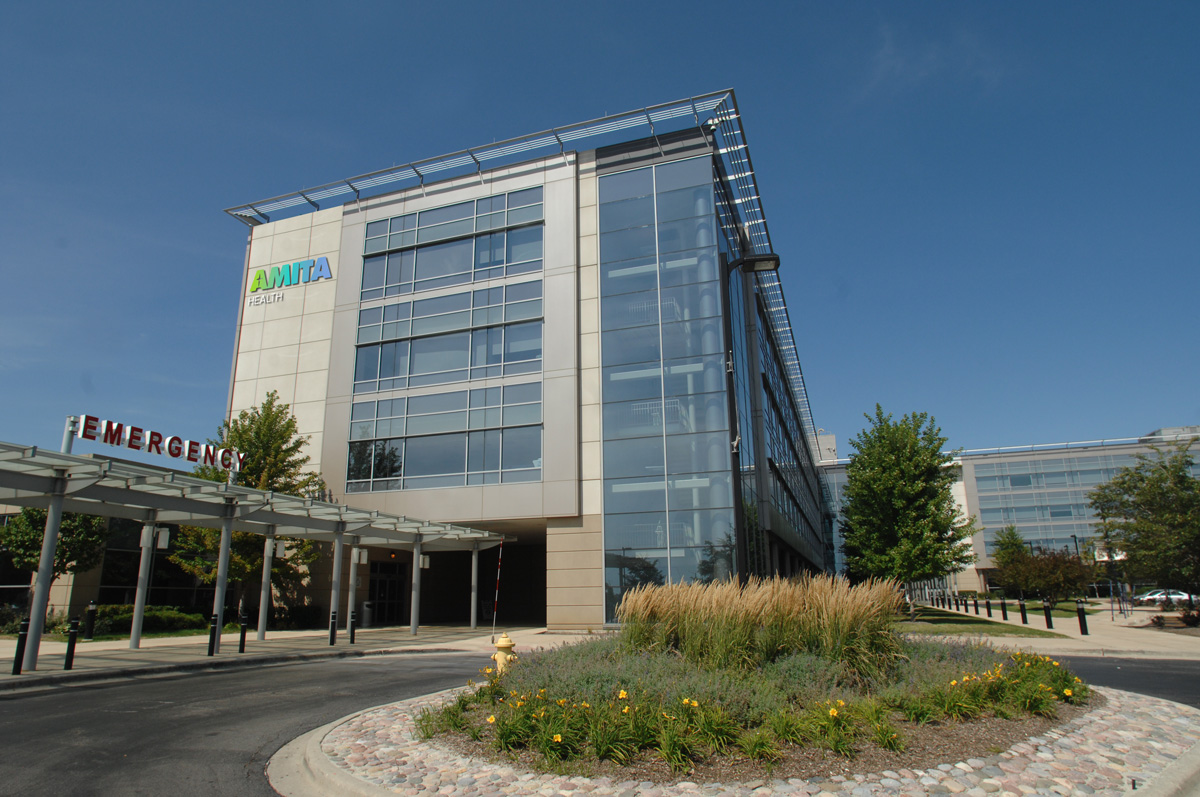
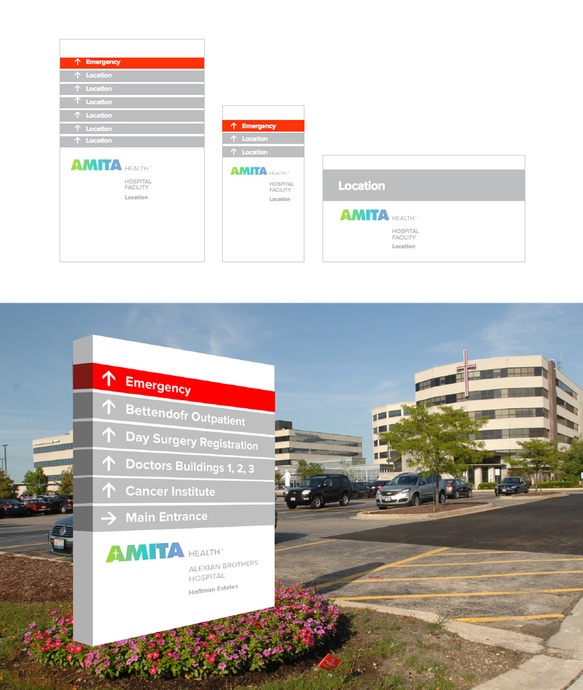
A comprehensive plan was developed to express the new brand identity, messaging, and touch points. This included consistent signage to help navigate the many campuses and building locations. The main goal of the signage is to reduce anxiety in patients and visitors. It fosters an open, transparent, friendly, and accessible environment.
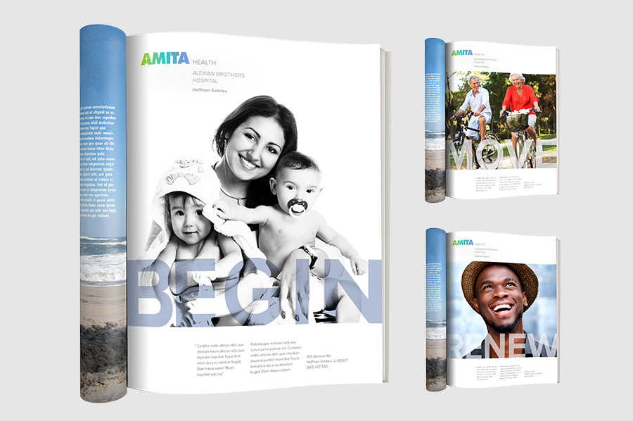
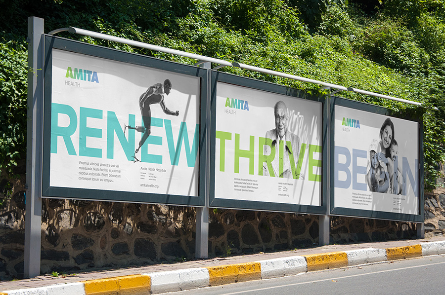
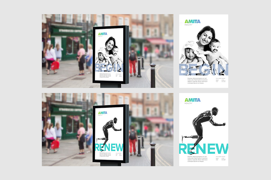
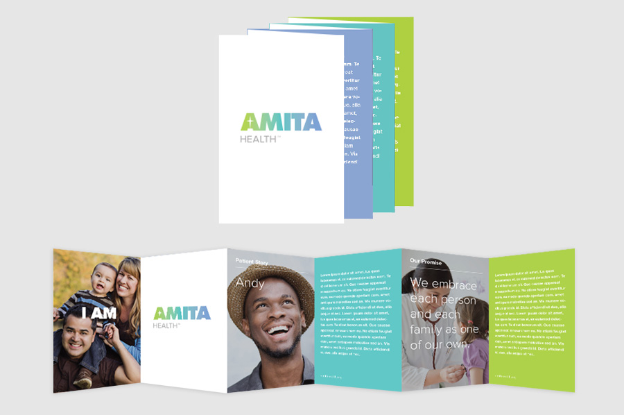
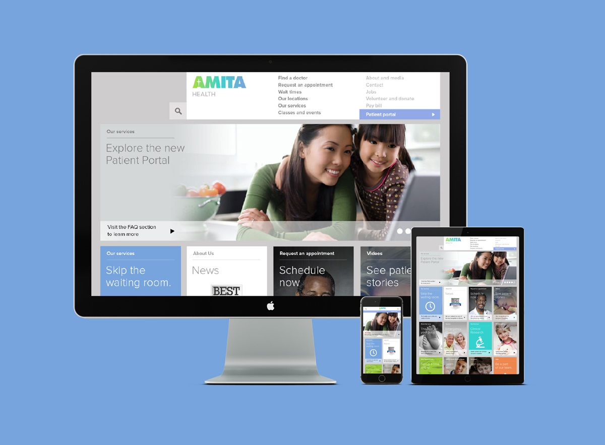
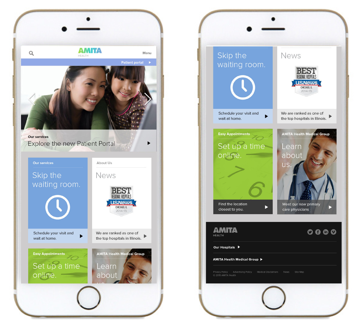
The Amita Health brand voice utilizes genuine photography, clean typography, and focuses on patient stories.
Creative Director: Greg Samata
Co-designers on project: Michal Janicki, Katelyn Reynolds
The color system uses green, blue, and lavender to evoke a fresh, calming, and regal atmosphere.
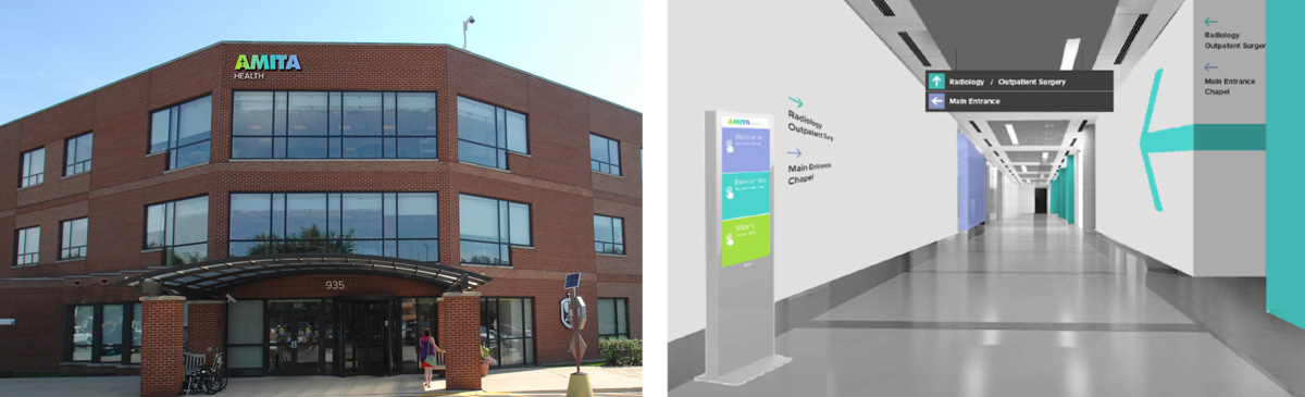
Signage is clean and clear, utilizing simple messaging to easy anxiety for patients and visitors.
The brochures focus on patient stories and positive experiences at Amita.
Users can make an appointment online, look up their doctors, and submit paperwork all before walking into the hospital.
The brand expression of AMITA Health was driven by the research insights: a health system made up of people committed to inclusiveness and personal relationships. AMITA Health advertisements use positive calls to action, bold headlines, and contemporary imagery.